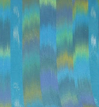
Painted Warp

Light bulb moment yesterday, but more on that later. Originally this was to be a red project but I found the red was leaning too far to the orange side. The painted warp, as usual not really looking quite like the photo, was fine to my eye but the solid warp (to the right) and the ikat were pinky/orangey red. I threw it into a pot of gold and voila! The blue, ahh, the lovely blue. I have finally arrived. In it's first life it was a very pretty medium blue, but I wanted a knock your socks off violet blue. (It really is, but again, not with this camera.) I sat myself down with a cuppa, pulled out the Knutson book and reread....................oh. my. gawd! I've been screwing up with the liquor ratio! Now I can't wait to wind another warp and try the reds again. By George, she's got it!


3 Comments:
Liquor ratio? Hmmm.... Rum and coke? Single malt? Gin and tonic? What makes the perfect blue? Do you put it in the dye?? or the dyer?
Or both? (works for me!)
bev
Excellent colors. Good for you for being brave with your experimentations. At least it would be brave if I were doing it.
Zowwie! The colors are popping on my monitor! I still have to figure out what you meant by the liquor ratio. Are you going to post what you found to be most successful?
Post a Comment
<< Home